 Log in


It's been nearly five years since Ridley Scott first announced his plans for a TV spinoff of his sci-fi masterpiece Blade Runner (1982) and the 2017 sequel Blade Runner 2049. It's finally here—or almost, anyway. Prime Video debuted the first teaser for the new ten-episode series, Blade Runner 2099, at San Diego Comic-Con on Friday. We also got a teaser for the third season of Prime Video's Rings of Power and a new trailer for HBO's Lanterns.
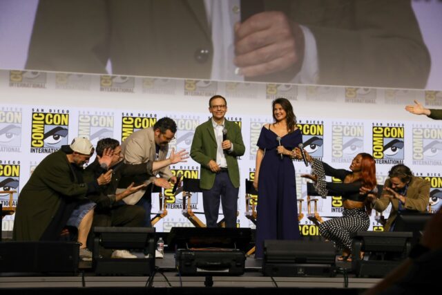
Yeoh and Schafer joined show runner Silka Luisa (Shining Girls) onstage for the big reveal, which also included an exclusive clip shown to the audience. Luisa told Entertainment Weekly that the series stays true to the original's "noir principles... and there's a mystery at the heart of the show that looks both forwards and backwards in terms of mythology." An uprising has occurred and the humans lost, which means they are now the hunted second-class citizens. "The show is really imagining what comes after us, and what does it mean to be human in a world where humanity is no longer relevant," said Luisa.
Per the official synopsis:
Fifty years after the events of Blade Runner 2049, Los Angeles has been reborn, just not by humanity. Cora, a fugitive in a final bid to stop running, takes on one last identity: a Blade Runner. Forced to partner with Olwen, a Replicant days from dying, she hunts down a runaway hiding a truth that could collapse their fragile city.
The incomparable Michelle Yeoh stars as Olwen, the dying Replicant, along with Hunter Schafer (Euphoria) as Cora. The cast also includes Hugo Hamlet as Buster Friendly, as well as Dmitri Abold, Lewis Gribben, Katelyn Rose Downey, Daniel Rigby, Johnny Harris, Amy Lennox, Sheila Atim, Matthew Needham, Tom Burke, and Maurizio Lombardi—all in as-yet-undisclosed roles.
Blade Runner 2099 will premiere on November 25, 2026, on Prime Video.
Rings of Power S3
Prime Video made a major investment in The Rings of Power when it acquired the rights to the source material from the Tolkien estate, even committing to multiple seasons upfront. We're now coming up on S3 and based on the teaser the streaming platform unveiled at SDCC, we'll finally get to see Sauron (Charlie Vickers) forging the One Ring.
Per the official synopsis:
In season three, Middle-earth is at war. Five years have passed since the fall of Eregion. Sauron’s armies have marched across the whole of the world, conquering all in their path. Only a few isolated pockets stand between the Dark Lord and total victory—Khazad-dǔm, where the Dwarves are now sealed deep within their mountain halls, and the elven realms of Lindon and Rivendell, which are protected by their Three Rings.”
But deep in the land of Mordor, in his newly completed tower of Barad-dûr, the Dark Lord toils day and night, obsessed with harnessing a power that will bring the last of his enemies to their knees: One ring to rule them all… Now, all the free peoples of Middle-earth—Dwarves, Elves, Men, and Wizards alike—must find a way to come together, in a race against time to prevent Sauron from achieving his goal of utter domination of all life
We're also getting some new characters this season, most notably Jamie Campbell Bower as Galadriel's (Morfydd Clark) long-lost husband Celeborn. Zubin Varla will play Khamul the Easterling of Rhun; Eddie Marson will play Thrain, order brother to King Durin IV (Owain Arthur); Andrew Richardson will play Anarion, younger son of Elendil (Lloyd Owen) and brother to Isildur (Maxim Baldry); and Adam Young will play an Orc named Marnukh who "might not be what he seems." Oh, and none other than Simon Pegg will voice the fiery Balrog.
The third season of Rings of Power premieres on November 11, 2026, on Prime Video.
Lanterns
We've seen a couple of teasers thus far for Lanterns, the new DC Universe series coming to HBO Max, both of which made it clear we're in for a show that's closer to a sci-fi True Detective than your standard superhero fare. HBO unveiled a full trailer at SDCC that is a little less Earthbound. It leans into the "space cop" vibe, reveals that shapeshifting Manhunters will be central to the plot, takes us into outer space, and also gives us our first look at Sinestro (Ulrich Thomsen), a former Corps member gone rogue. HBO threw in seven preview clips for good measure, although these have not been released publicly.
Per the official logline, “The series follows new recruit John Stewart (Aaron Pierre) and Lantern legend Hal Jordan (Kyle Chandler), two intergalactic cops drawn into a dark, earth-based mystery as they investigate a murder in the American heartland.” There will be two storylines: one set in 2016 about a murder in Nebraska, and the second set in 2026.
Chandler’s Hal Jordan is a former test pilot nearing retirement from the Green Lantern Corps. He’s training Pierre’s John Stewart Jr., a new recruit, to replace him. Nathan Fillion reprises his Superman role as the obnoxious Guy Gardner; we get a brief glimpse of him in the new teaser. The cast also includes Kelly MacDonald as Kerry, a small-town family-oriented sheriff; Jason Ritter as Billy Macon, Kerry’s husband; Garret Dillahunt as William Macon, Kerry’s cowboy father-in-law; Poorna Jagannathan as a woman named Zoe; and Paul Ben-Victor as an extraterrestrial called Antaan.
Sherman Augustus plays John Stewart Sr., with J. Alphonse Nicholson playing the younger version; Nicole Ari Parker plays Bernadette Stewart (mother to John Jr.), with Jasmine Cephas Jones playing the young version of the character. In addition, Chris Coy plays a suspiciously nervous truck driver, Waylon Sanders; Cary Christopher plays a gifted child named Noah; Laura Linney will play a senior Guardian; and Paula Patton will appear in an as-yet-undisclosed guest role. We also know that the show will feature the inter-dimensional prison and the Checkmate organization introduced in Peacemaker’s S2 finale.
Lanterns premieres on August 18, 2026, on HBO Max.
Spaceballs: The New One
 Credit:
Chris Frawley / Amazon MGM Studios
Credit:
Chris Frawley / Amazon MGM Studios
This long-overdue sequel to Mel Brooks' 1987 cult classic isn't being released until next spring, but that didn't stop Amazon MGM Studios from putting together an SDCC panel this year anyway in a clever parody of the extravagant Marvel panels of yore. Because it's early days, there haven't been any publicly released teasers or trailers, although some teaser footage was shown at CinemaCon in April and yesterday at SDCC.
Apparently we owe this sequel to Josh Gad, who co-wrote the script and pitched Brooks on a cold call. Gad has said he showed the original movie to his daughter during the COVID-19 pandemic and she loved it so much she wanted to see the sequel. Here's the official synopsis:
Somehow, Dark Helmet has returned! Forty years after the events of the first Spaceballs, fifty years after the events of Star Wars: A New Hope, and one year after the events of The Devil Wears Prada 2, the galaxy is once again under threat. A threat so evil, so unstoppable, so completely lacking in any original ideas, that it has vowed to bring back the past… every last bit of it.
With Lone Starr in hiding, Queen Vespa on the throne, and the Schwartz stretched thinner than a franchise releasing TV episodes theatrically, the only hope for the galaxy is Vespa’s undisciplined son, Prince Starburst, and a mysterious Palace advisor named Destiny. Together, they must find Lone Starr, Yogurt, and any other iconic legacy characters fans are demanding before they discover the hard way that, while some threats you can fight, the reboot is not one of them.
The 100-year-old Brooks is reprising his role as Yogurt via motion capture (he filmed his lines in a studio). Also returning: Rick Moranis as Lord Dark Helmet, Bill Pullman as Lone Starr, Daphne Zuniga as Queen Vespa, and George Wyner as Colonel Sandurz. Pullman's son, Lewis Pullman, joins the cast as Prince Starburst, son to Lone Starr and Vespa, along with Keke Palmer as a palace advisor named Destiny. Gad plays a mawg, the same species as the late John Candy's Barf. Anthony Carrigan and Rowan Witt have also been cast in as-yet-undisclosed roles.
Spaceballs: The New One hits theaters on April 23, 2027. May the Schwartz be with you!
 Credit:
AmazonMGMStudios
Credit:
AmazonMGMStudios

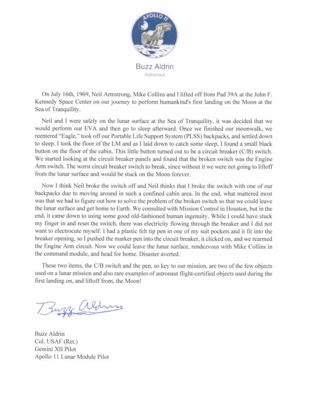 Apollo 11 astronaut Buzz Aldrin's letter describing the broken circuit breaker switch and felt-tip pin from his Moon mission.
Credit:
Sotheby's
Apollo 11 astronaut Buzz Aldrin's letter describing the broken circuit breaker switch and felt-tip pin from his Moon mission.
Credit:
Sotheby's
 The location of the engine arm circuit breaker switch in the Apollo lunar module that was broken off on Apollo 11.
Credit:
NASA
The location of the engine arm circuit breaker switch in the Apollo lunar module that was broken off on Apollo 11.
Credit:
NASA
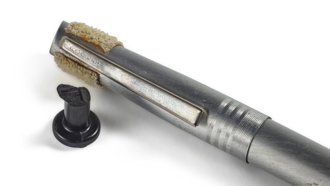
 The broken circuit breaker switch that nearly ended Apollo 11, and the pen that Buzz Aldrin used to save himself and Neil Armstrong.
Credit:
Sotheby's
The broken circuit breaker switch that nearly ended Apollo 11, and the pen that Buzz Aldrin used to save himself and Neil Armstrong.
Credit:
Sotheby's
 Credit:


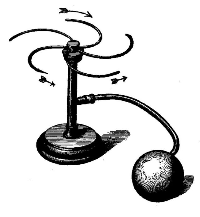 Illustration of a “reaction wheel” from Ernst Mach’s Mechanik (1883).
Credit:
Public domain
Illustration of a “reaction wheel” from Ernst Mach’s Mechanik (1883).
Credit:
Public domain


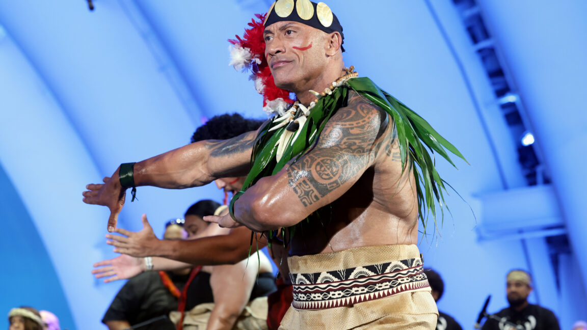
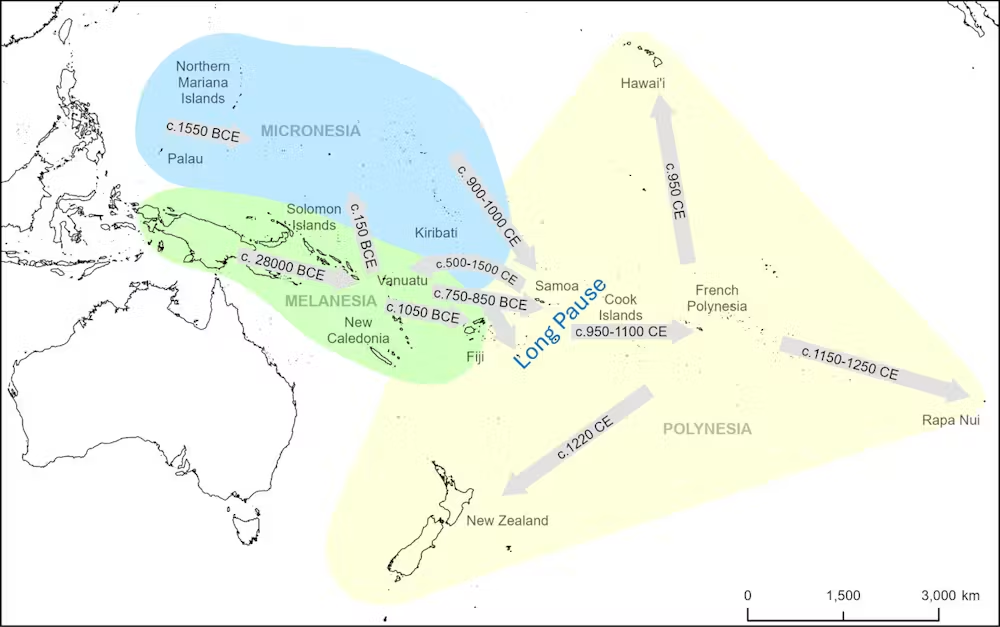 Ancestral Polynesians only moved beyond Samoa and Tonga after a 1,700-year "long pause." The remaining island archipelagos were then settled rapidly.
Credit:
Ancestral Polynesians only moved beyond Samoa and Tonga after a 1,700-year "long pause." The remaining island archipelagos were then settled rapidly.
Credit:
 Humans mostly arrived in the eastern Pacific soon after a dry period (marked orange) of long-term climate conditions further west (top graph) and a series of sudden ‘dry shocks’ (marked orange, in the middle graph).
Credit:
Humans mostly arrived in the eastern Pacific soon after a dry period (marked orange) of long-term climate conditions further west (top graph) and a series of sudden ‘dry shocks’ (marked orange, in the middle graph).
Credit: